Κατέβασμα παρουσίασης
Η παρουσίαση φορτώνεται. Παρακαλείστε να περιμένετε

1
Χαράλαμπος Καραγιαννίδης karagian@uth.gr
Διάλεξη 5 Ευχρηστία & Προσβασιμότητα Ανάπτυξη Εφαρμογών για την Εκπαίδευση & την Ειδική Αγωγή Χαράλαμπος Καραγιαννίδης

2
Να επιμείνουμε λίγο εδώ...
Σύνοψη μαθήματος Εισαγωγή Εκπαιδευτικός Σχεδιασμός, Εργασία Εκπαιδευτική Ρομποτική Συγγραφή Επιστημονικών Κειμένων Ευχρηστία & Προσβασιμότητα Να επιμείνουμε λίγο εδώ...

3
Δηλαδή…

4
Σύνοψη διάλεξης Ευχρηστία Αρχές ευχρηστίας Προσβασιμότητα
what, why, examples Αρχές ευχρηστίας guidelines heuristics Προσβασιμότητα guidelines, tools

5
What – definition & terms
Usability (ευχρηστία) – ISO the effectiveness, efficiency & satisfaction, with which specific groups of users perform specific tasks within specific environments of use the ease of use and learnability of a human-made object – a software application, website, book, tool, machine, process, or anything a human interacts with User interface (διεπαφή χρήσης) the part of the system that the user is working with Other terms ergonomics, human factors, human-computer interaction
 – ISO. the effectiveness, efficiency & satisfaction, with which specific groups of users perform specific tasks within specific environments of use. the ease of use and learnability of a human-made object – a software application, website, book, tool, machine, process, or anything a human interacts with. User interface (διεπαφή χρήσης) the part of the system that the user is working with. Other terms. ergonomics, human factors, human-computer interaction.")
6
What – components Learnability - how easy is it for users to accomplish basic tasks the first time they encounter the design? Efficiency - once users have learned the design, how quickly can they perform tasks? Memorability - when users return to the design after a period of not using it, how easily can they re establish proficiency? Errors - how many errors do users make, how severe are these errors, and how easily can they recover from the errors? Satisfaction - how pleasant is it to use the design?

7
Why Application form Telephone device Also
less errors annual savings of over $ Telephone device faster dialing annual savings of over $ Also ATMs video machines consumer appliances etc

8
Why (2/2) Lee L., The day the phones stopped: How people can get hurt when computers go wrong, Primus Donald I. Fine, 1992. Three Mile Island, 1980 one led mistakenly showed that a valve was closed one important device was hidden ... by a sign the alarm system included more than 1500 visual and audio warnings

9
Interface hall of fame

10
Interface hall of fame (2/2)
")
11
Interface hall of shame

12
Interface hall of shame (2/2)
")
13
Μια μικρή διαφορά στο σχεδιασμό ...

14
Σύνοψη διάλεξης Ευχρηστία Αρχές ευχρηστίας Προσβασιμότητα
what, why, examples Αρχές ευχρηστίας guidelines heuristics Προσβασιμότητα guidelines, tools

15
Ανθρωποκεντρικός σχεδιασμός
User-centred design a framework of processes (not restricted to interfaces or technologies) in which the needs, wants, and limitations of end users of a product, service or process are given extensive attention at each stage of the design process
 in which the needs, wants, and limitations of end users of a product, service or process. are given extensive attention at each stage of the design process.")
16
Αρχές The design is based upon an explicit understanding of users, tasks and environments Users are involved throughout design and development The design is driven and refined by user-centered evaluation The process is iterative The design addresses the whole user experience The design team includes multidisciplinary skills and perspectives

17
Ευχρηστία του web

18
Σημαντικά λάθη…

19
Usability heuristics Visibility of system status
The system should always keep users informed about what is going on, through appropriate feedback within reasonable time. Match between system and the real world The system should speak the users' language, with words, phrases and concepts familiar to the user, rather than system-oriented terms. Follow real-world conventions, making information appear in a natural and logical order. User control and freedom Users often choose system functions by mistake and will need a clearly marked "emergency exit" to leave the unwanted state without having to go through an extended dialogue. Support undo and redo. Consistency and standards Users should not have to wonder whether different words, situations, or actions mean the same thing. Follow platform conventions.

20
Usability heuristics (2/3)
Error prevention Even better than good error messages is a careful design which prevents a problem from occurring in the first place. Either eliminate error-prone conditions or check for them and present users with a confirmation option before they commit to the action. Recognition rather than recall Minimize the user's memory load by making objects, actions, and options visible. The user should not have to remember information from one part of the dialogue to another. Instructions for use of the system should be visible or easily retrievable whenever appropriate. Flexibility and efficiency of use Accelerators -- unseen by the novice user -- may often speed up the interaction for the expert user such that the system can cater to both inexperienced and experienced users. Allow users to tailor frequent actions

21
Usability heuristics (3/3)
Aesthetic and minimalist design Dialogues should not contain information which is irrelevant or rarely needed. Every extra unit of information in a dialogue competes with the relevant units of information and diminishes their relative visibility. Help users recognize, diagnose, and recover from errors Error messages should be expressed in plain language (no codes), precisely indicate the problem, and constructively suggest a solution. Help and documentation Even though it is better if the system can be used without documentation, it may be necessary to provide help and documentation. Any such information should be easy to search, focused on the user's task, list concrete steps to be carried out, and not be too large.
, precisely indicate the problem, and constructively suggest a solution. Help and documentation. Even though it is better if the system can be used without documentation, it may be necessary to provide help and documentation. Any such information should be easy to search, focused on the user s task, list concrete steps to be carried out, and not be too large.")
22
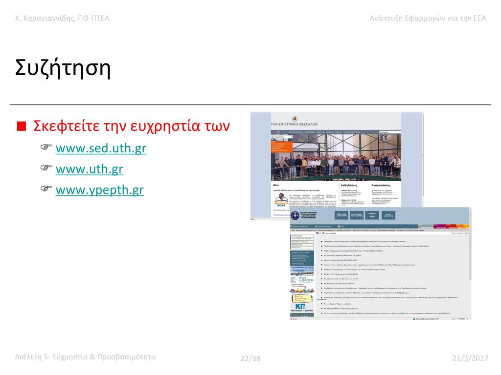
Συζήτηση Σκεφτείτε την ευχρηστία των www.sed.uth.gr www.uth.gr
23
Αλλά και των εκπαιδευτικών λογισμικών…

24
Και η εργασία κύριε??? Αρχές ευχρηστίας από τα usability heuristics
consistence and standards error prevention error recovery help Εξειδικευμένες αρχές για την ομάδα εκπαιδευομένων που σας ενδιαφέρει e.g. Google for “usability guidelines autism” Διεπαφή χρήσης μόνιμο template εισαγωγή δεδομένων μέσω μενού αντί για κείμενο undo… επιλογή βοήθειας σε κάθε οθόνη keep it as simple and short as the subject permits

25
Σύνοψη διάλεξης Ευχρηστία Αρχές ευχρηστίας Προσβασιμότητα
what, why, examples Αρχές ευχρηστίας guidelines heuristics Προσβασιμότητα guidelines, tools

26
Προσβασιμότητα Ιστού – what
Web accessibility people with disabilities can use the web: they can perceive, understand, navigate, and interact with the web, and that they can contribute to the web web accessibility also benefits others, including older people with changing abilities due to aging"

27
Προσβασιμότητα Ιστού – why
Σημασία "the web is an increasingly important resource in many aspects of life: education, employment, government, commerce, health care, recreation, and more it is essential that the web be accessible in order to provide equal access and equal opportunity to people with disabilities an accessible web can also help people with disabilities more actively participate in society"

28
Παραδείγματα Οι χρήστες του web μπορεί
να μην έχουν τη δυνατότητα να δουν, ακούσουν, κινηθούν, ή να επεξεργαστούν συγκεκριμένους τύπους πληροφορίας να συναντούν δυσκολίες στην ανάγνωση και κατανόηση του κειμένου να μη διαθέτουν (ή να μη μπορούν να χρησιμοποιήσουν) πληκτρολόγιο ή ποντίκι να διαθέτουν μια οθόνη κειμένου, μια μικρή οθόνη, μια αργή σύνδεση με το Internet, κλπ
 πληκτρολόγιο ή ποντίκι. να διαθέτουν μια οθόνη κειμένου, μια μικρή οθόνη, μια αργή σύνδεση με το Internet, κλπ.")
29
Δηλαδή... Έχετε σκεφτεί, για παράδειγμα, πώς "ακούγεται" το site του ΠΘ, του ΠΤΕΑ, κλπ???

30
Προσβασιμότητα ιστού – how
Οδηγίες για τη δημιουργία προσβάσιμου δικτυακού περιεχομένου (web content accessibility guidelines) που περιλαμβάνουν και συγκεκριμένες τεχνικές Καθώς και οδηγίες για τα εργαλεία ανάπτυξης (authoring tools) εργαλεία αξιολόγησης της προσβασιμότητας (accessibility checkers) εργαλεία επισκευής της προσβασιμότητας (accessibility repair tools)
 που περιλαμβάνουν και συγκεκριμένες τεχνικές. Καθώς και. οδηγίες για τα εργαλεία ανάπτυξης (authoring tools) εργαλεία αξιολόγησης της προσβασιμότητας (accessibility checkers) εργαλεία επισκευής της προσβασιμότητας (accessibility repair tools)")
31
Οδηγίες Το περιεχόμενο πρέπει να είναι δυνατό να το λάβουν όλοι (perceivable) 1.1 Συμπεριλάβετε εναλλακτικά κείμενα για κάθε κομμάτι περιεχομένου που δεν είναι σε μορφή κειμένου 1.2 Συμπεριλάβετε εναλλακτικό περιεχόμενο για τα πολυμέσα 1.3 Διαχωρίστε την πληροφορία από την παρουσίασή της 1.4 Διευκολύνετε το διαχωρισμό της πληροφορίας από το φόντο (foreground/background)
")
32
Οδηγίες (2/4) Τα στοιχεία αλληλεπίδρασης πρέπει να είναι λειτουργικά για όλους 2.1 Όλες οι λειτουργίες πρέπει να είναι διαθέσιμες μέσω του πληκτρολογίου 2.2 Οι χρήστες πρέπει να έχουν τον έλεγχο στο χρόνο (ανάγνωσης, αλληλεπίδρασης, κλπ) 2.3 Οι χρήστες πρέπει να μπορούν να αποφύγουν το περιεχόμενο που τους δυσκολεύει λόγω φωτο-ευαισθησίας 2.4 Οι χρήστες πρέπει να διαθέτουν μηχανισμούς για να αναζητούν περιεχόμενο, να προσανατολίζονται, κλπ 2.5 Βοηθήστε τους χρήστες να αποφύγουν τα λάθη, και να τα επανορθώνουν όταν συμβαίνουν
 2.3 Οι χρήστες πρέπει να μπορούν να αποφύγουν το περιεχόμενο που τους δυσκολεύει λόγω φωτο-ευαισθησίας. 2.4 Οι χρήστες πρέπει να διαθέτουν μηχανισμούς για να αναζητούν περιεχόμενο, να προσανατολίζονται, κλπ. 2.5 Βοηθήστε τους χρήστες να αποφύγουν τα λάθη, και να τα επανορθώνουν όταν συμβαίνουν.")
33
Οδηγίες (3/4) Το περιεχόμενο και τα στοιχεία ελέγχου πρέπει να είναι κατανοητά 3.1 Διασφαλίστε ότι το κείμενο είναι ευανάγνωστο και κατανοητό 3.2 Διασφαλίστε ότι η τοποθέτηση και η λειτουργία του περιεχομένου είναι εύκολα προβλέψιμη

34
Οδηγίες (4/4) Το περιεχόμενο πρέπει να μπορεί να είναι λειτουργικό με διάφορες τεχνολογίες 4.1 Υποστηρίξτε τη συμβατότητα με σύγχρονες και μελλοντικές τεχνολογίες (συμπεριλαμβανομένης και της υποστηρικτικής τεχνολογίας) 4.2 Διασφαλίστε ότι το περιεχόμενο είναι προσβάσιμο, ή συμπεριλάβετε μια προσβάσιμη εναλλακτική έκδοση
 4.2 Διασφαλίστε ότι το περιεχόμενο είναι προσβάσιμο, ή συμπεριλάβετε μια προσβάσιμη εναλλακτική έκδοση.")
35
Παράδειγμα εργαλείου αξιολόγησης

36
Πρόσβαση σε ψηφιακό περιεχόμενο
USDE Accessibility Enhancement Initiative Accessibility Requirements for Electronic Documents W3C Web Accessibility Initiative Web Content Accessibility Guidelines

37
Webliography

38
Καλό απόγευμα

Παρόμοιες παρουσιάσεις


, Performance Indicators (PIs), Key Performance Indicators (KPIs)>")


 Διδάσκων: Καθηγητής Χρήστος.>")
